Do you remember Spiral, the £100m Daniel Libeskind proposal for the Victoria & Albert Museum? Hugely controversial it proposed the insertion of a pile of tumbling and intersecting cubes in to the space now occupied by the new Sackler Courtyard.
One critic noted that Libeskind’s wonky pile looked like “the Guggenheim turned on its side and then beaten senseless with a hammer”. Despite winning planning permission, this violent and chaotic insertion never found favour with the UK’s conservative establishment and in 2004 was discarded.
Another problem was that it was full of small galleries and a lot of stairs. This was at a time when the Victoria & Albert Museum started to realise that the most pressing need was for fewer, larger exhibition spaces to house the money making blockbuster shows.
They are therefore probably highly relieved that the Libeskind project died, eventually to be replaced by a project that now went underground. Amanda Levete Architects (AL_A) won the brief to produce an alternative to Spiral, against stiff competition and have produced something that is both stunning and practical.
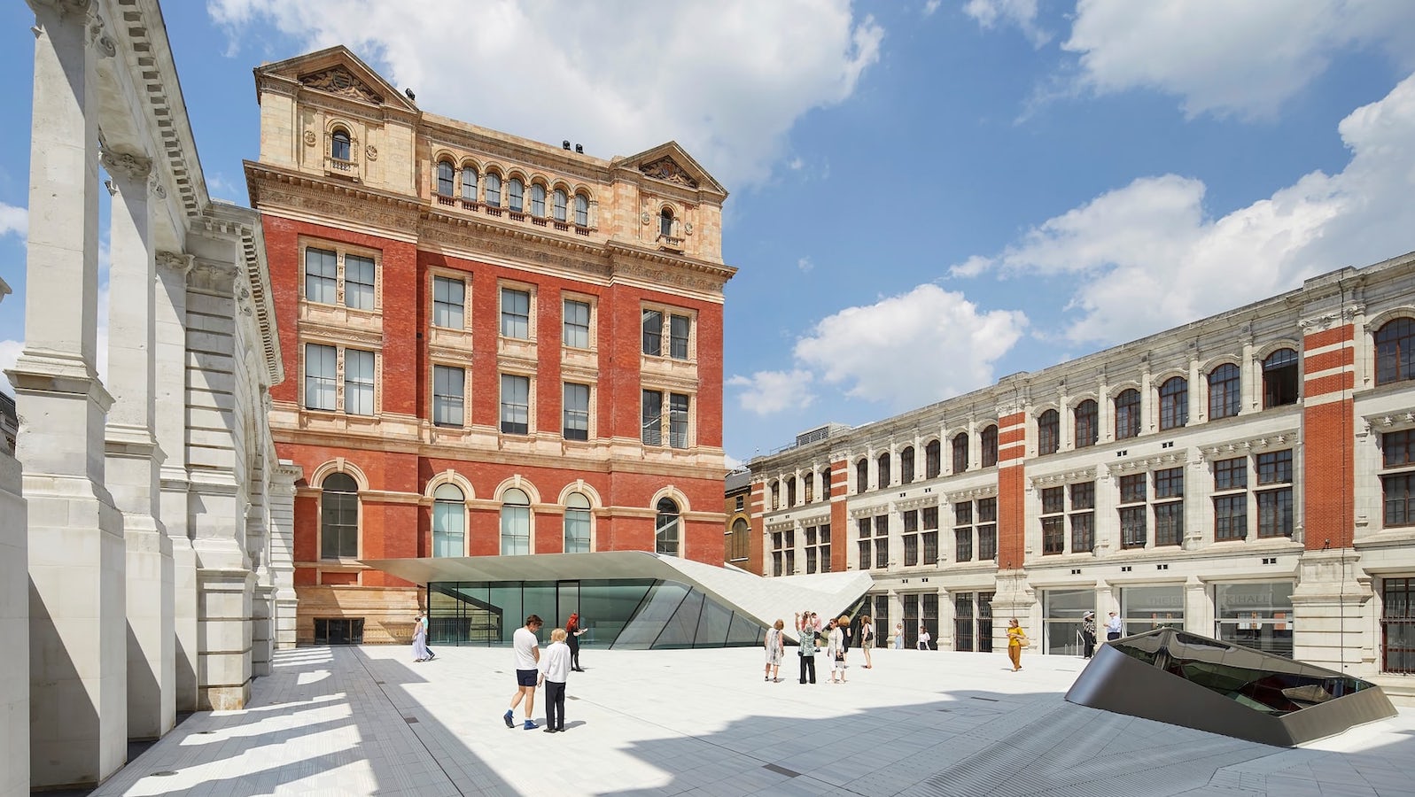
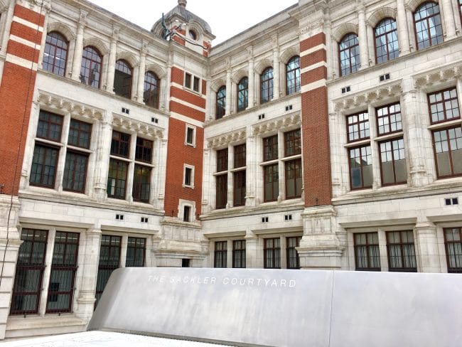
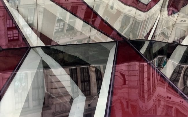
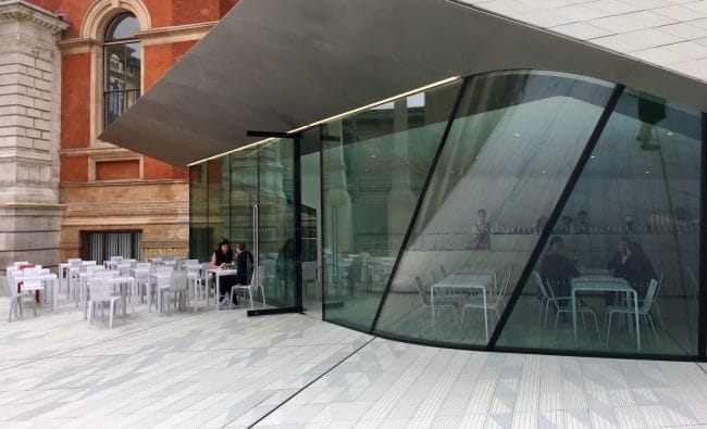
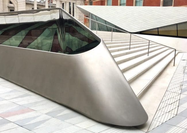
A dark, forgotten and hidden courtyard is now a gleaming expanse of sparkling porcelain. The white tiles, are delicately patterned, striped and textured, a nod to the V&A’s patronage and use of 19th century ceramics. The gently sloping area is broken by steps and a ramp towards the main building and is pierced by an intruiging skylight from the gallery below. An elegant white cafe (with excellent catering) sits to one side, its only fault being that it is surely too small.
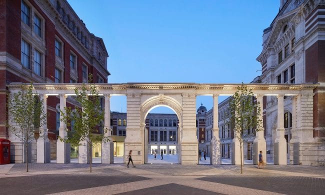
Entry to the new Sackler Courtyard is via access cut through the arches of an 19th-century screen designed by Sir Aston Webb. The spaces are now occupied at low level by perforated aluminium screens which cleverly reflect the shrapnel scars of the original stone.
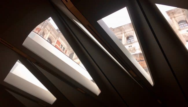
Not only does this provide badly needed new access for the increasing numbers of visitors to the V&A but also opens up the museum to Exhibition Road. It also makes it possible to see the previously hidden facades of the original building for the first time since its completion in 1873. Suddenly there is a new sense of connection to the street, Natural History and Science museums.
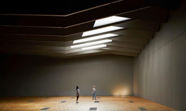
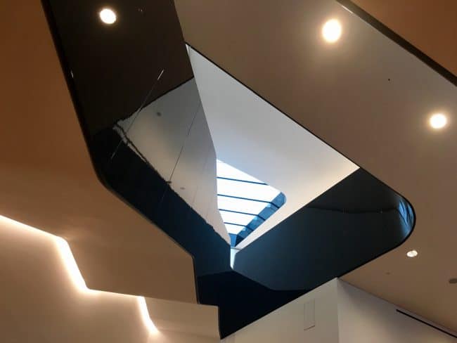
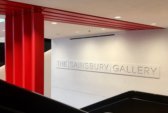
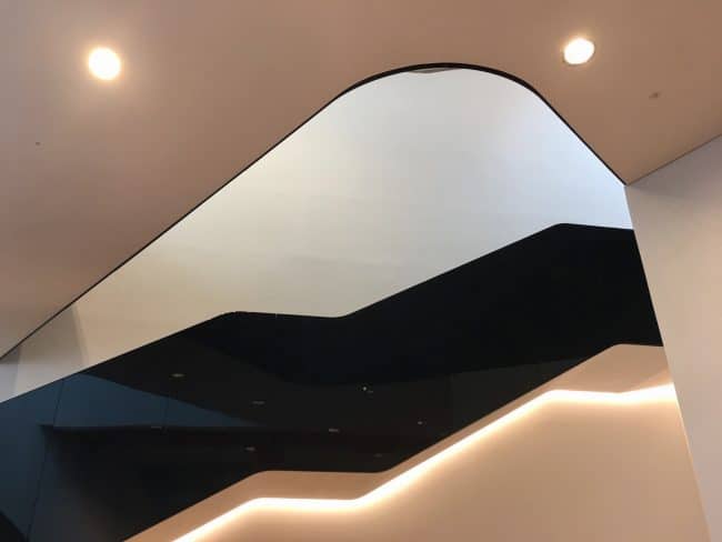
Down below, via a spectacularly architectural stairwell in red, white and black, is the Sainsbury Gallery, a new 1,100 square metre column-free space. This is one of the largest temporary exhibition spaces in the UK and will allow the V&A to significantly improve the way it designs and presents its world class exhibition programme.
The whole is a huge success and we can hardly wait until September to see the first use of this space with opening of the inaugural exhibition, Opera: Passion Power and Politics.
CELLOPHANELAND* were guests of the Victoria & Albert Museum
For more information visit Victoria & Albert Museum
For current Exhibitions at the V&A visit Victoria & Albert Museum


